
Let’s Make an Entrance! Before and After Entry Series.
Entries are top priority on many of my clients must-have lists. Quite honestly, it’s in my top three favorite rooms or spaces to decorate.
This is the first room guests walk into as they arrive in your home. Therefore, to me, it has to be your statement piece. I feel that I can get away with a little more in this usually smaller space; I have yet to work with a large entry, and I look forward to the opportunity of doing so!
I just finished decorating three entries, and want to share them because I’m super excited about the end results. I plan to post two more in this three-part entry series so keep checking back!
Modern Eclectic
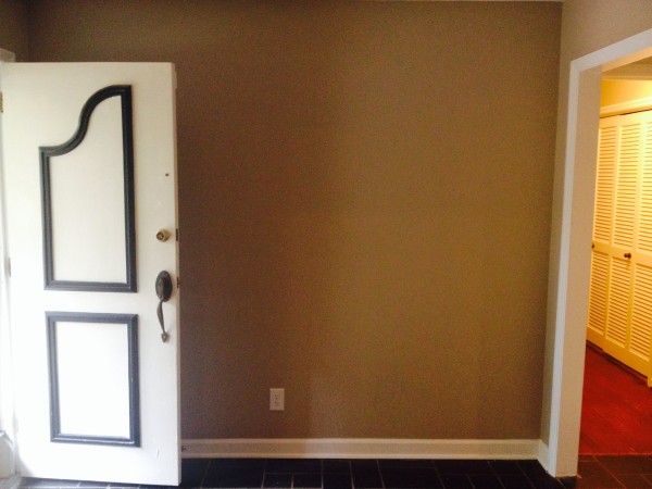
This first entry was for my funkier, streamlined, eclectic, mid-century modern clients. The space was a little dreary before, and we really wanted to make this space pop.
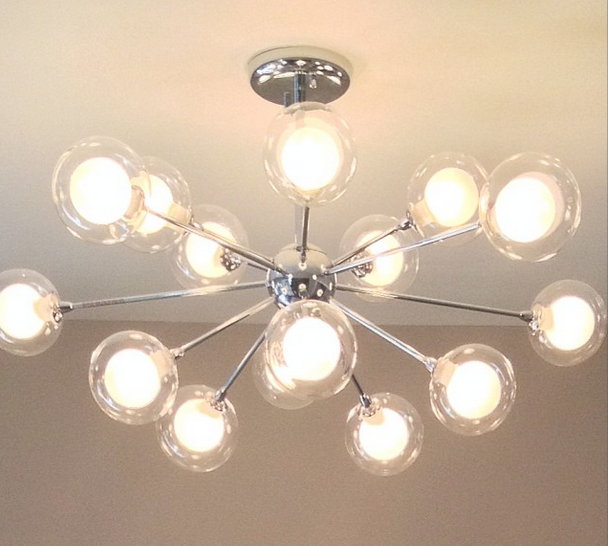
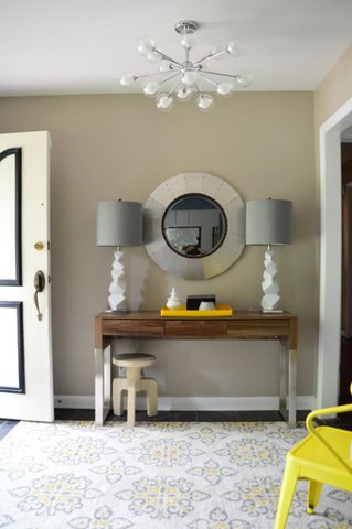
The biggest challenge in this home was the eight-foot ceiling, which narrowed down our selection pool for a great entry light. I knew I wanted a sputnik-type light but could not find one in the right height. Then, I stumbled across this one from Lamps Plus, and voila! I cannot begin to explain how gorgeous this is in person; the photos cannot do it justice.
I have to tell you, I can sit and stare at this light all day. When I’m in their den looking into the entry, the light simply makes me happy. It brings such a good feeling to this home.
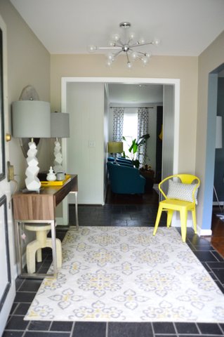
On to the rest of the room! Their entrance color is a warmer grey, which is extremely versatile, so I had a lot of options to play with. You can also see into the den from the entry, and we had already placed peacock blue chairs in that space, so I wanted to play off the blue as well as the pops of yellow found in that room and the formal den to the right.
Bring on the after shots!!
Product Breakdown:
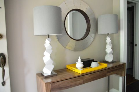
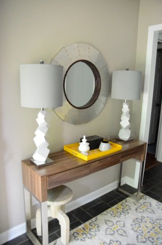
Console table – Joss and Main
White ceramic lamps – Home Goods
Round mirror and yellow tray – Home Goods
Sputnik light – Lamps Plus
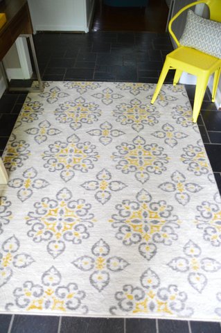
Shaw rug, pillow, box and urn – Target
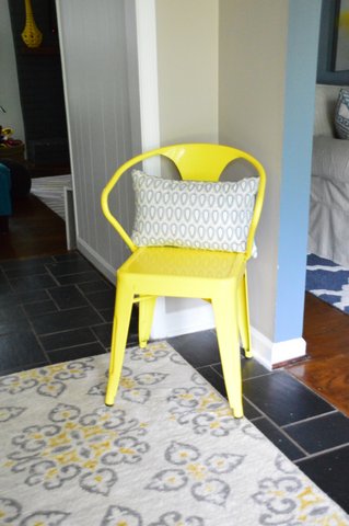
Yellow metal chair – local store named Eclectic
In the end, I think everyone was pleasantly surprised. And, I still stop by just to look at that sputnik again. Sigh.
Sorry, the comment form is closed at this time.


Victoria | the Maypop
Agree…I swoon over that Sputnik every time I see it too. The sight line from the front door through to the den is so lovely.
Krystine
Thank you Vicki!
Elizabeth @ The Little Black Door
I totally agree. Entires are so fun to work on and they make such a difference in the feel of a home. I love what you did with this space!
Krystine
Thank you Elizabeth!
StagerLinda
I am IN LOVE with that light fixture! You took this foyer to maximum potential. Great colors and textures.
Krystine
Thank you so much!
HomeGoods Insider
Hi Krystine, so happy to discover your blog. We love how you describe entryways as a “statement piece.” It tells a lot about the people who live there. Thanks for shopping with us!
Krystine
Thank you! Always enjoy shopping with y’all!
Josh Urso Design
You have a great eye for modern, unique shapes and scales. I also just love a lot of the pieces you’ve chosen but can’t easily identify where they’re from. It’s definitely not cookie cutter. It’s memorable, fun, and inviting. I’d like to stay a while and get to know the inhabitants of this house 🙂 Now that’s a successful foyer design.